Markinor
Markinor is one of the largest independent marketing research groups in South Africa. It carries out a wide range of research in the consumer, retail, media, and pharmaceutical fields, and its clients include 20 of South Africa's top 30 marketing companies.
We overhauled and redesigned the company's entire brand identity and image.
Branding • Design • Art Direction
Agency: Interbrand Sampson


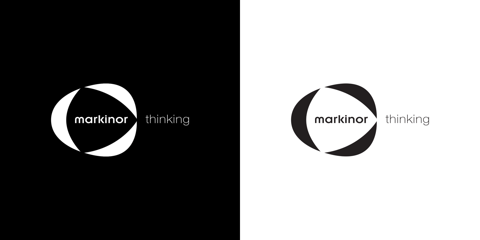
The logo is made up of three shapes forming a unit, incorporating the tagline 'thinking' into the logo design. The subtle white space this creates forms an arrow. There are two color variations of the logo, and it also works powerfully in black and white.


The stationery employs both color variations of the logo, creating visual interest and variety.
I've used curves derived from the logo shapes as a secondary design element to anchor the logo and the supporting text.

I've also developed a set of brand guidelines to ensure the consistent application of the brand assets.
The logo is constructed on a grid, ensuring that proportions and alignment are pixel perfect.

