The Windmill Trading Company
The Windmill Trading Company is a small business that sells several ethically sourced, artisan delicacies and goods.
The owner asked me to design their logo and develop their brand identity. Naturally, a windmill had to feature prominently in the design.
Branding • Design
Agency: Freelance

I started sketching some ideas, incorporating different windmill designs as well as the rather lengthy name of the company.

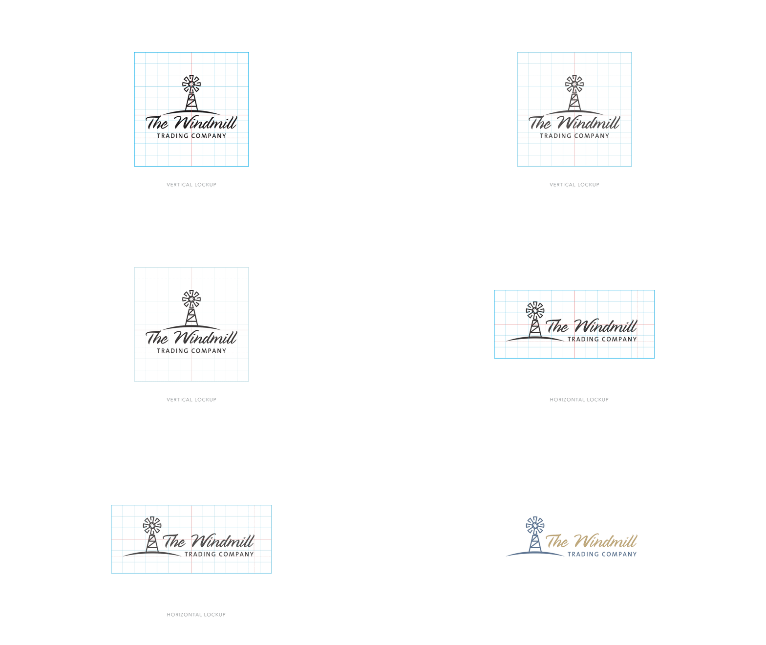
After a few rounds of back and forth, a clear winner emerged. I refined the design to include a vertical and a horizontal lockup for different applications and made sure that all the elements of the logo align to a grid.

Anticipating the company's need for later brand applications, I created a mini color palette to give them an idea of how you can combine secondary colors with their primary colors.

The logo colors can be inverted to create visual interest in different applications.

I sourced a collection of icons for use on product packaging elements.


The logo without the wordmark is a robust graphic element perfect for use on photography or a plain background.

In keeping with the earthy artisan look and feel, I've suggested a piece of reclaimed wood as shop signage, whitewashed, with the logo handpainted on the surface.


Packaging design is kept simple and graphic to complement the logo and wordmark.

