Sasol
Sasol is an international integrated energy and chemical giant. When the agency I worked for at the time set out to do a complete, international rebranding exercise, we were up for the challenge.
Wearing many hats, I was involved in several aspects of the rebranding, including art direction, overseeing photo shoots, and writing as well as designing a comprehensive volume of brand guidelines.
Branding • Design • Art Direction
Agency: Interbrand Sampson


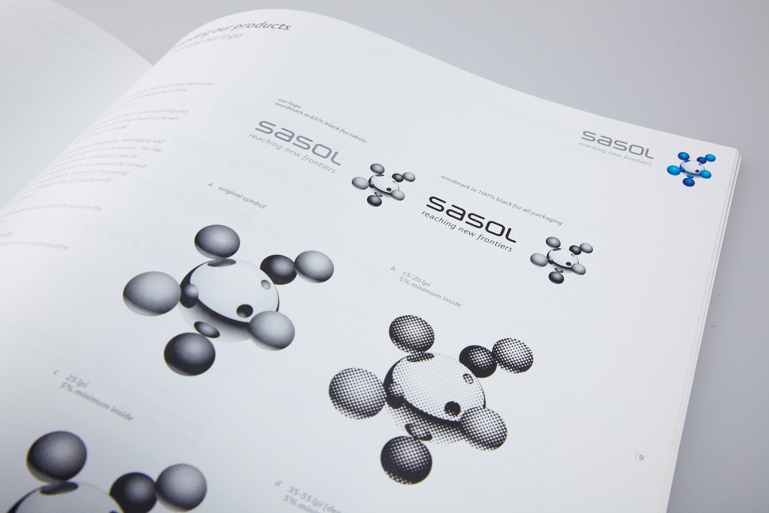
The logo has a few configurations, and it was necessary to arrange each one of them on a grid and to write the technical copy in a way that is clear enough for suppliers to understand.


Since the logo can sometimes appear cropped on specific applications, we had to illustrate in detail how it may be cropped.

Brand book
Sasol needed a summarized brand book highlighting its fundamental brand principles. We used lifestyle photography, and I've art directed photoshoots of their gas stations for this publication.


Brand guidelines
A significant challenge for the brand guidelines was to shoot somewhat bland subject matter like industrial packaging in such a way that it is visually appealing and artistic.

Industrial packaging doesn't have to be boring. We've developed a vibrant secondary color palette to apply to boxes, bags, and drums.


We focused on Sasol being people-centric in our layouts, making sure that a healthy dose of people in lifestyle situations is present.


Sasol Delight is the name for the shop attached to each of their gas stations. I was directly involved as an art director, working with a team of photographers to capture photos for use throughout the brand book and guidelines.
